Top 10 Business Signage Mistakes to Avoid
Your Outdoor Signage is Important to Your Business
Have you ever passed by a place of business that has a worn-out old sign or a sign that’s partially covered, broken, or missing? You probably wondered if the establishment is even open since no one seems to be worried about the appearance of their critical outdoor advertising. Now imagine if that same place had a clear, visible, well-lit sign with attractive art and coloration. Would you be more likely to stop in?
Your business signs are the face of your business, doubly so if your signs contain your logo. It’s not something that should be slapped together as an afterthought or left to decay. Be sure that your outdoor signage properly represents the quality of your products or service by avoiding these common business sign mistakes.
1. Poor Color Choice
This is an easy mistake to make and it can be made in several ways. Maybe you have a color scheme going on that you want to stick to, but there’s not enough contrast, so you end up with a very pretty sign that no one can read from a distance.
Or maybe you’re going for big visibility, so you use bright, high-contrast colors and end up with something that looks like it belongs outside of a bad used car dealership. You want enough contrast in your promotional advertising that people can see and read them from your intended distance, but you don’t want to look cheap and gaudy.
There’s a long-standing practice of color-blocking, pairing warm and cool colors, in marketing materials to attract attention (think Burger King, Pepsi, FedEx, Tide, Microsoft). It’s a great tactic, as long as it fits with your brand image and brand personality and uses complementary colors that are easy to read and easy on the eyes.

2. Uneven Spacing
Just like a poor color choice, uneven spacing can be hard on the eyes. This is generally only a problem for DIY small business signs and roadside advertising. It’s not a mistake a custom business sign designer is likely to make.
If you are designing your own outdoor signage, keep some spacing best practices in mind. First, letter spacing should be even throughout the text. That means ensuring that your font transfers well because some fonts adjust the spacing between certain pairs of letters to improve the aesthetic, and they might not look the same in the finished product unless the printer/manufacturer takes special care.
Second, the spacing around your letters should be balanced with the size of the text. The negative space is just as important as the lettering itself in enhancing legibility and visual appeal. Depending on your design and the amount of text and imagery you have, you’ll have to work out a custom balance, but a simplified guideline might look like this:
The total height of the negative space above and below your text should equal half the height of the text, or be fairly close. The width of the negative space before and after your text and between words should equal the height of the negative space below your text.

3. Illegible
Several factors can affect legibility, and legibility is probably the most important aspect of outdoor signage, so it’s important to be mindful of anything that could make your effort and investment go to waste.
First, as we discussed, is the color. Contrast makes it easier to see the text. Spacing also affects legibility (see above). Next is the font. Choose a font that can be read at a glance. If people have to spend time deciphering your roadside advertising, they won't. It's generally a good idea to stay away from fancy scripts, old English, or anything that's too bold, too thin, too deliberately messy or uses symbols in place of letters.

4. Bad Art
There are a ton of ways art can go bad on custom business signs. If you’re placing a logo or image on your outdoor signage, try showing the finished design to several different people who are unrelated to your business to get their feedback. Is it clear? Does it unintentionally resemble anything that you don’t want to be associated with your brand? Will it be easy or difficult for people to associate this image with your brand?
When you’re dealing with a sign that people will be viewing from the road, the other side of a parking lot, or even the highway, make sure it’s big enough and simple enough to be understood. You might have the perfect lifestyle image of your product or service in action, but if it’s not clear, it won’t be effective. Signs for business do better with logos, simple graphics, or very simple, single-subject images.
If you haven’t seen any slideshows or blog posts about unintentional images in logos, you should, but be warned there is some seriously suggestive material in those listicles. It just goes to show, the more outside feedback and perspective you can get on your art before finalizing, the better.
You also want to make sure your design targets the right audience. If you’re marketing to children, your design will be different than if you were marketing to women, which would be different than if you were marketing to men, which would be different than if you were marketing to athletes, and so on.

5. Transfer Issues
This is another issue that mostly plagues DIYers, not promotional signage experts. The transfer from your design platform to the printing software can cause letters and images to become flipped backward and/or upside down. Exercise caution if you’re tackling the process alone. Flipped letters and images can ruin a great sign.

6. Improper Installation
Proper installation is crucial for the safety of your staff and visitors and the longevity of your sign. Drilling holes in the wrong part of your individual letters to secure them to the wall with screws will allow moisture into the layers beneath the exterior sealant. That means damage, rust, chipping, and a highly-accelerated lifespan.
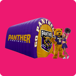
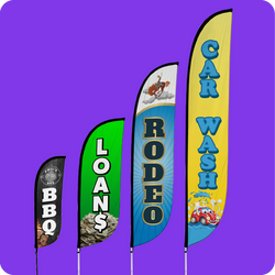
Improper installation of inflatables can lead to damage to the blower motor or to the inflatable itself while improper installation of feather flags and other promotional signs can cause damage to or loss of the materials, not to mention property damage,accident, and injury. Don’t let your sign be a liability to your business. Make sure your sign is properly and professionally secured in its location.

7. Wrong Material
Most of the materials available in outdoor signs for business today have their place, and you don’t necessarily have to spend more to get a product that will perform well in your location. The primary consideration should be the weather the sign will be exposed to.
If it will be in the sun all day every day, you’re going to need a fade-resistant ink. If it’s going to rain a lot, consider waterproof materials. Acrylic or vinyl could give you extra years on your coastal business signs that are constantly subjected to the destructive effects of sea salt. Talk to your business signage professional about the best material for your applications.
You also want to make sure your material and design match your brand image. If you’re a laid-back small business, a four-foot, solid gold logo sculpture might look out of place in your lobby. Instead of focusing on the price of the material, focus on what works where you need it.

8. Too Big or Small
Where are the people who are looking at your signs going to be? Will they be standing outside your front door? Will they be a quarter mile down the expressway? It’s important to advertise to both foot traffic and car traffic, depending on your location, but everyone has to be able to see your signs. If the sign is too big for people who are up close, they’ll have a hard time deciphering it or might not notice it at all. The same goes for a sign that’s too small for people who are further away.
Barring any vision issues, four-inch text can generally be read for up to 100 feet. Sixteen inches can be read for up to a city block and 57 inches can be read for a quarter mile. Remember you don’t just want people to be able to make out what your sign says. You want them to be able to clearly understand your sign at a glance.

9. Poor Visibility
It’s not just size that affects visibility. There are endless factors in keeping your outdoor business signage front and center. The trick is to see and imagine your location in different seasons and times and check it from the perspective of your audience, not just from right outside your door.
Don’t just evaluate the spot at noon in winter and call it good. That same spot could be covered with landscaping and foliage in spring or be cast in shadow at night. It’s essential to install adequate night lighting regardless of your business hours or the existing lighting for the location. Just because your doors are locked doesn’t mean people won’t remember that sign when you open back up.

10. Bad Timing
Getting ready for a grand opening, product launch, or big promotion? Order your sign far enough in advance that you can take care of any hiccups that arise and get it installed in time to start advertising. Your outdoor signage represents the quality of your business, so you don’t want to be stuck with low-quality stand-ins or with no signage at all on the big day.
Inadequate Security
It’s unfortunate, but a lot of locations have trouble with graffiti and even theft of business property. Consider the security risks in your area and plan accordingly. There are steps you can take to help avoid certain types of vandalism in the future.
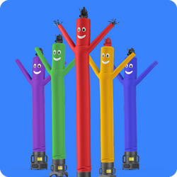
Consider an acrylic material to make graffiti removal relatively easy. Have a professional install your sign to make theft more difficult. When possible, bring promotional advertising materials like inflatable tube men, canopy tents, and feather flags indoors when you close up. Custom printed balloons should be installed up high, out of reach of nighttime pedestrians.
Tips for Designing Effective Outdoor Business Signage
The best advice for creating effective business signage is to work with a pro who knows the business. You’ll achieve a better quality will lower risk in a shorter time than you’re likely to achieve on your own, considering all the details that have to be managed throughout the process.
Talk to your designer about your timeline to find out what’s realistic for completion and delivery and make sure that works with your opening day or event plans. Ask about installation and maintenance services that could save you big bucks in replacement, repair, and liability down the line. If your brand has an established color scheme you’d like to use for your promotional materials, provide the color names or hexadecimal codes so your designer can create some business signage that represents your establishment.
It’s also a good idea to tell your designer what your intended applications are and the weather that your signage will be exposed to, so he or she can confirm that the chosen materials and sizes are adequate. Printed balloons with four-inch-tall lettering might not be the best choice for roadside advertising that needs to be seen from the freeway. Discuss your target audience, as that could have a major impact on your design.
Find out what lighting you’ll need for your business signage if you don’t already know and get recommendations for improving security. Finally, find out how long your signs are expected to last. Longevity plays a big part in the long-term cost of your outdoor promotional advertising.
LookOurWay Promotional Advertising Experts
If you’re in the market for a business signage design expert, give us a call at (866) 586-3888 or request a free sign design at LookOurWay.com. It only takes one hour to get your free design mockup. LookOurWay designs custom printed feather flags, inflatables, canopy tents, balloons, and other sign options at the most competitive prices using the highest quality materials. Get the world’s best brand of inflatable tube men, Air Dancers®, same-day shipping, and the best customer experience in the industry.
